Every year, organisations pour months of work and real money into a document almost no one reads past page three. The annual report has become a duty, a compliance exercise in a beige cover. But a report is the one time a year a brand has its stakeholders' full attention, in one place, on purpose. Wasting that is the real cost.
A report is a brand asset, not a filing
Numbers alone do not build belief. The report is where a company gets to show not just what it did but why it matters, to investors, partners, employees, and the people it serves. Treated as design, it becomes a story with evidence. Treated as paperwork, it becomes a PDF nobody opens twice.
Design is how dense becomes readable
Financials, ESG data and impact metrics are heavy by nature. Good editorial design is what makes them land, a clear grid, real typographic hierarchy, data visualised instead of dumped. The information does not get simpler, it gets navigable. Readers finish more of a well-designed report because it respects their attention.
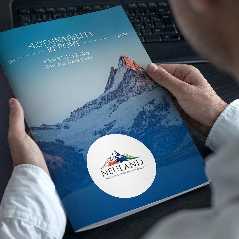
The cover earns the open
People decide whether to engage with a document in seconds, the same way they judge a book. A considered cover and a strong opening spread signal that what follows is worth the time. A tired template signals the opposite before a single figure has been read.
Made to be reused, not just released
A report should not be a once-a-year fire drill. Built as a system, a grid, a type specimen, a set of chart styles, it becomes faster and cheaper every year, and consistent across every edition. The craft compounds instead of restarting from a blank page.
The Uppercut view
We design reports people actually finish. That means treating the annual report as the flagship publication it is, not the chore it became. Do it well and the document you were obligated to produce turns into one of the most persuasive things your brand puts out all year.